Why I Made the Change
My previous site, built with Gatsby, was becoming increasingly difficult to maintain due to aging packages and a broken build process. Updating was cumbersome, and using Netlify CMS felt unnecessary since I’m the sole editor of the site. I needed more flexibility to iterate quickly and decided to prioritize simplicity over rigid structure.
Why Next.js & Vercel?
I went with Next.js because of the ease of maintenance over Gatsby. One major issue I couldn’t get around was the SASS compiler package I was using for my previous site - it was deprecated, and I couldn’t find an easy alternative. I really like that Next.js comes with SASS built in.
I had also built my site around GraphQL before, and it wasn’t enhancing my editing experience; in fact, it was hindering it. I wasn’t able to easily change layouts or add items the way I wanted to.
Hosting with Vercel sealed the deal. The simplicity and seamless deployment process made managing the site a breeze.
User Experience Improvements
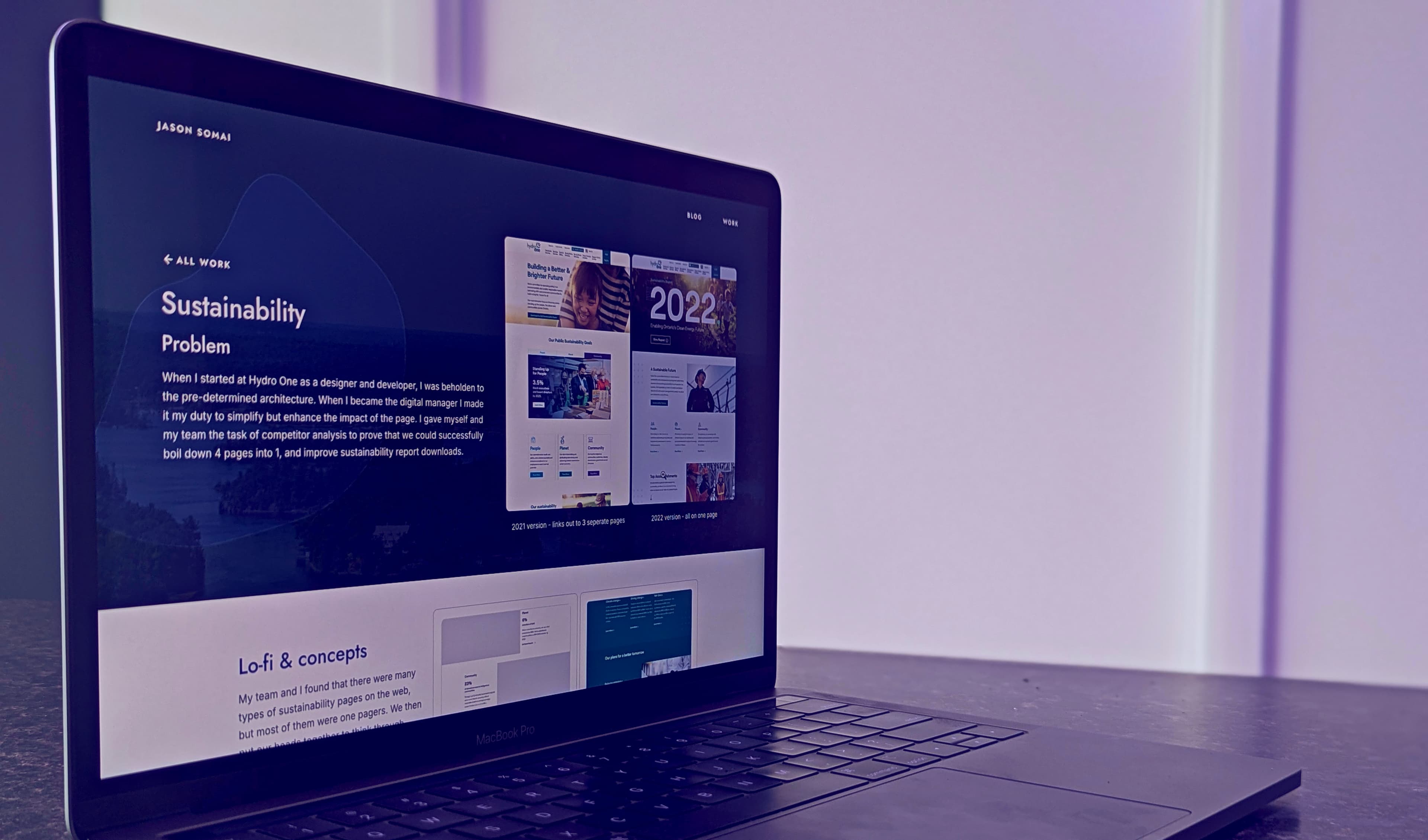
I kept my blob-based design aesthetic but refreshed it by creating new background blobs in Figma. To swap between blob shapes, I used Anime.js for it's dead simple SVG morphing feature.

Rather than doing a full UI redesign, I iterated on how the information I was providing was being interpreted.
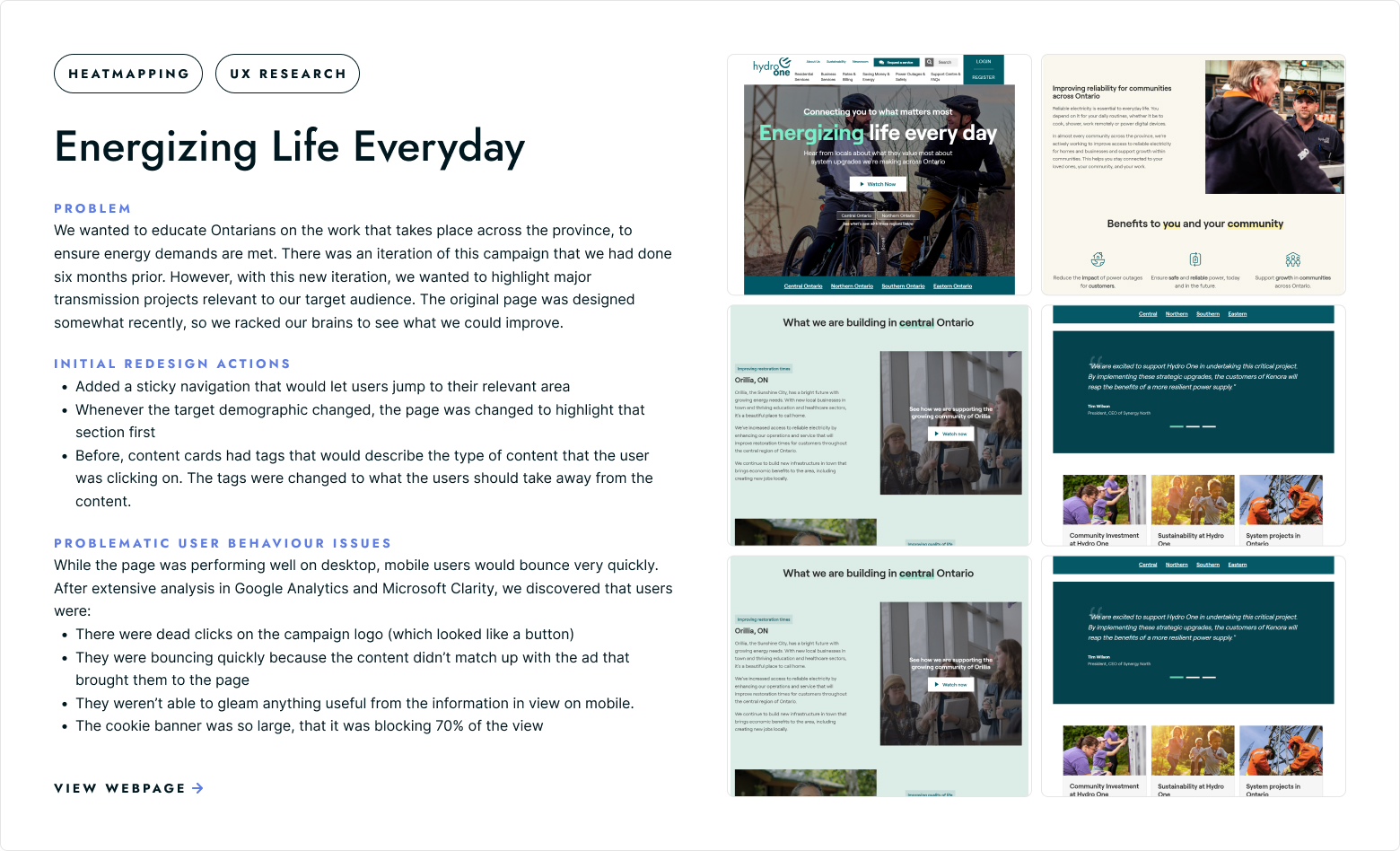
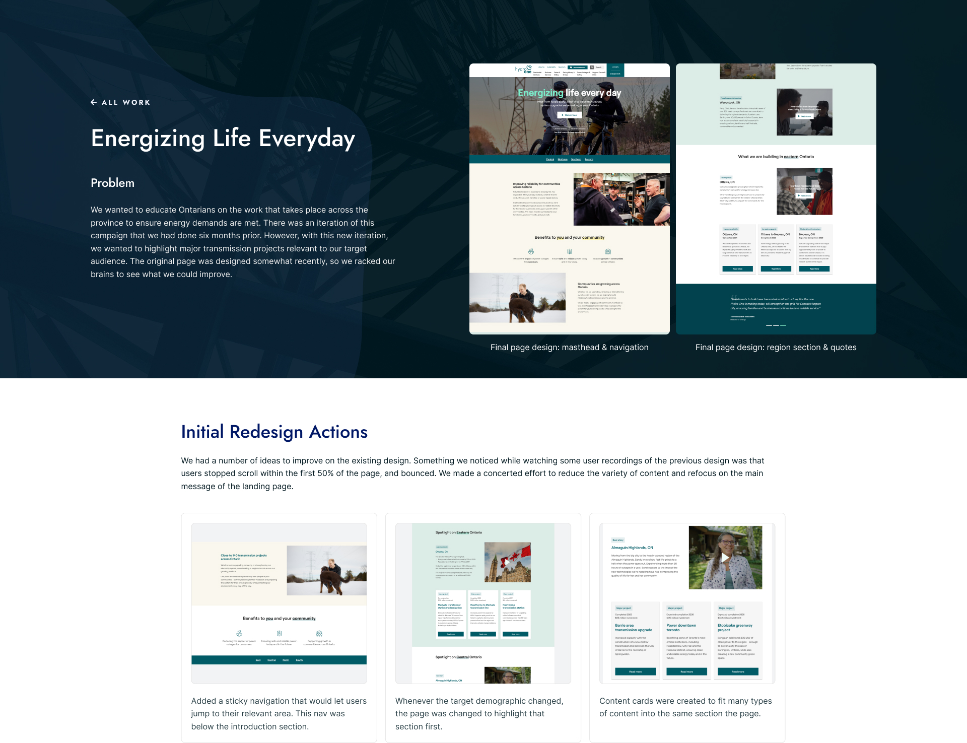
One key realization came after asking for feedback from friends. They struggled to understand my grouped project pages, which was a hit to my ego, but it was a good reminder to never assume what users will do. Instead of cramming multiple projects into one page, I now focus each portfolio page on a single project, allowing me to dive deeper into the nuances and storytelling.


View the final page
I also focused on providing context for the imagery I was having users look at, rather than hoping they could associate the text around the image with it. This iterative approach made my portfolio more user-friendly and helped me better showcase my work.
Fun Fact
The most popular page on my old website was the Contact Form 7 blog. It consistently got visits across the globe, which is chalked up to WordPress and Contact Form 7's popularity.
I plan to write more and hopefully beat that page’s performance. It’s a low bar, but a bar nonetheless.
