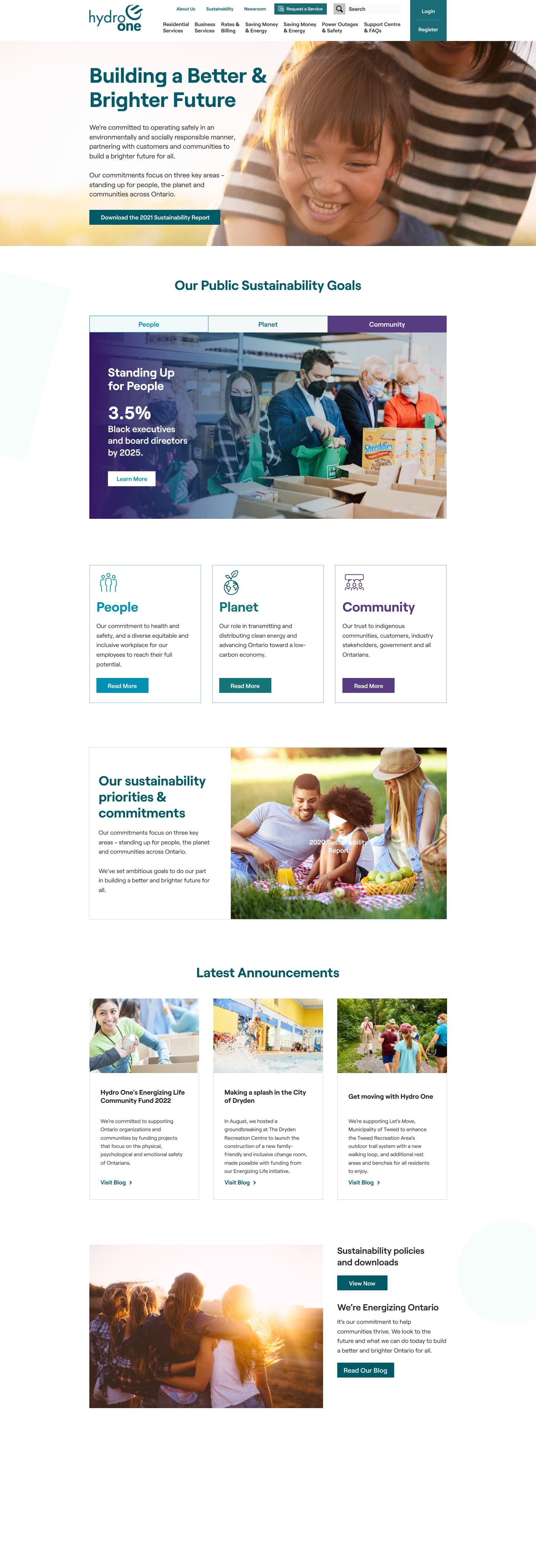
Lo-fi & concepts
My team and I found that there were many types of sustainability pages on the web, but most of them were one pagers. We then put our heads together to think through what a version of this would look like for our website.
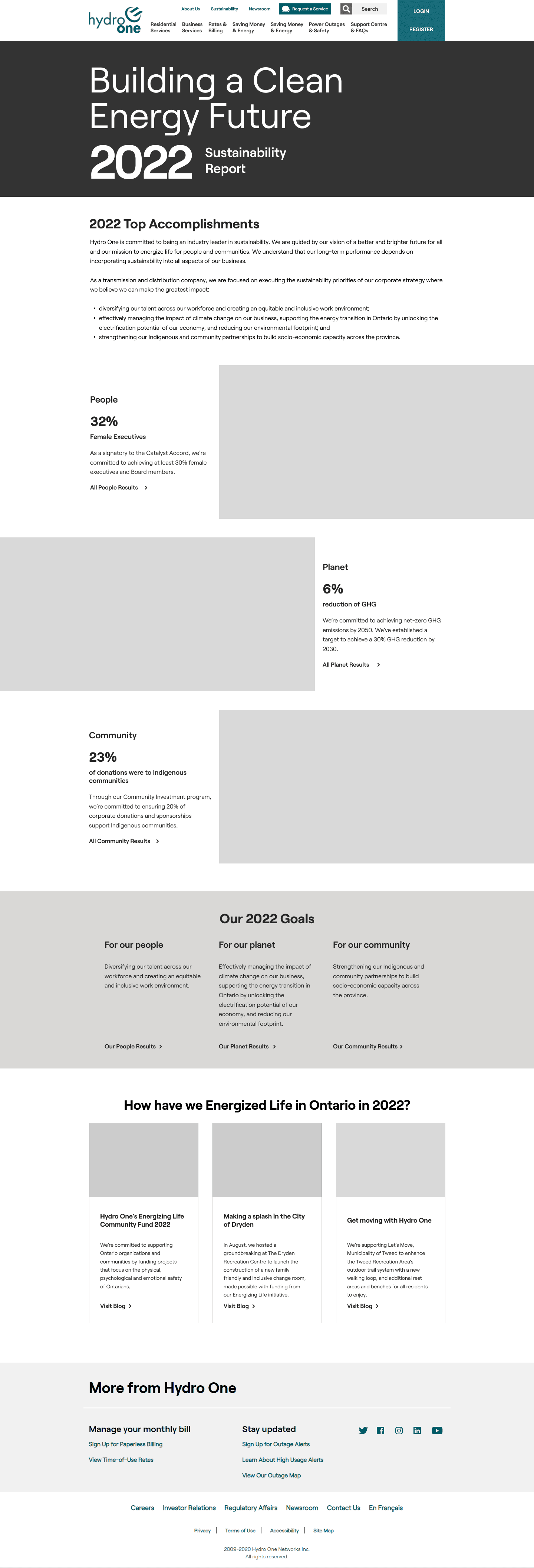

UI Design
My UX designer and I collaborated on this design, trading off ideas that we've seen in all of our research. We really wanted to showcase our creativity, our brands multiple colours and big beautiful pictures. All while having some cool background effects and animations.
Hats off to you, Jacob Di Domenico!
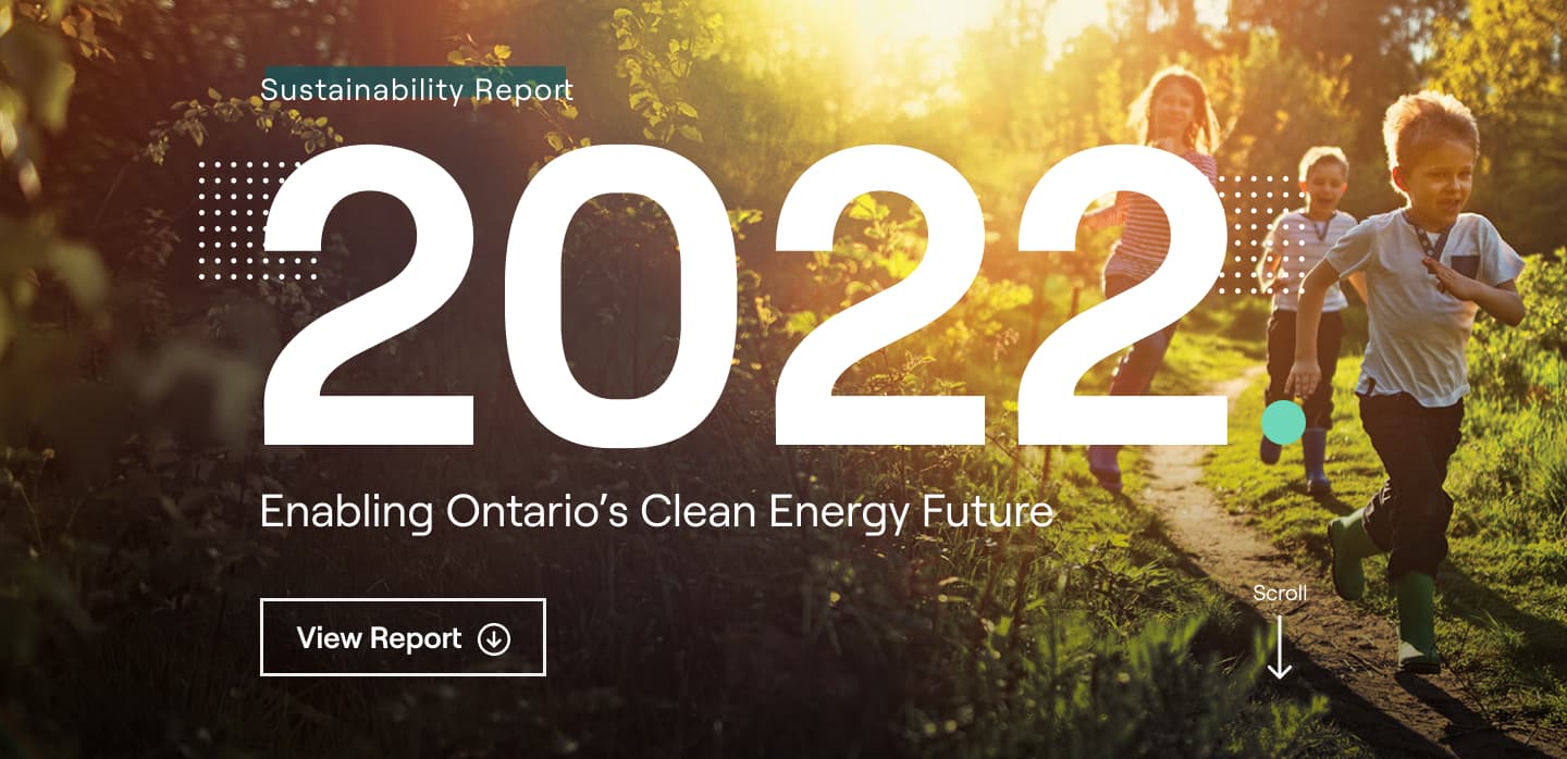
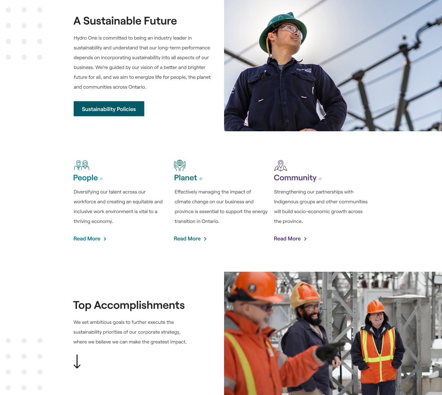
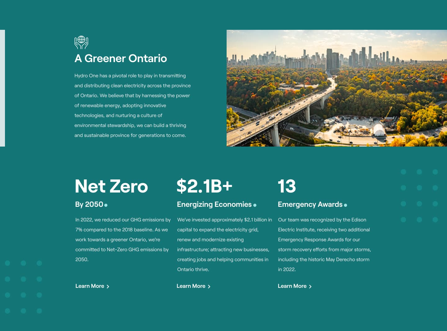
We also implemented the on-scroll animation technique I had blogged about before to add some simple transitions to each section. In addition to that, we have a cubic-bezier scaling animation on our background dot effects. Simple animations go a far way, and are performant!
Results
Despite not driving advertising to the page, our improvements shocked us. While we decreased our time spent on page, due to consolidating information, the downloads for the report increased 34% and our pages per session went up 44%. This had proven that our strategy of combining multiple pages into one cohesive page has paid off.
We ended up using this as the basis for the 2023 sustainablity page which is currently live.
